Fresh Tasty & Local
Downey Farms / Packaging
Since 1924, the Downeys have grown their business one delicious potato at a time. Today, they are one of the few Canadian sources of GMO free potatoes.
Until recently, the public was unaware that a local option was available from Downey, so we created an original product line to give consumers an organic option that is locally grown.
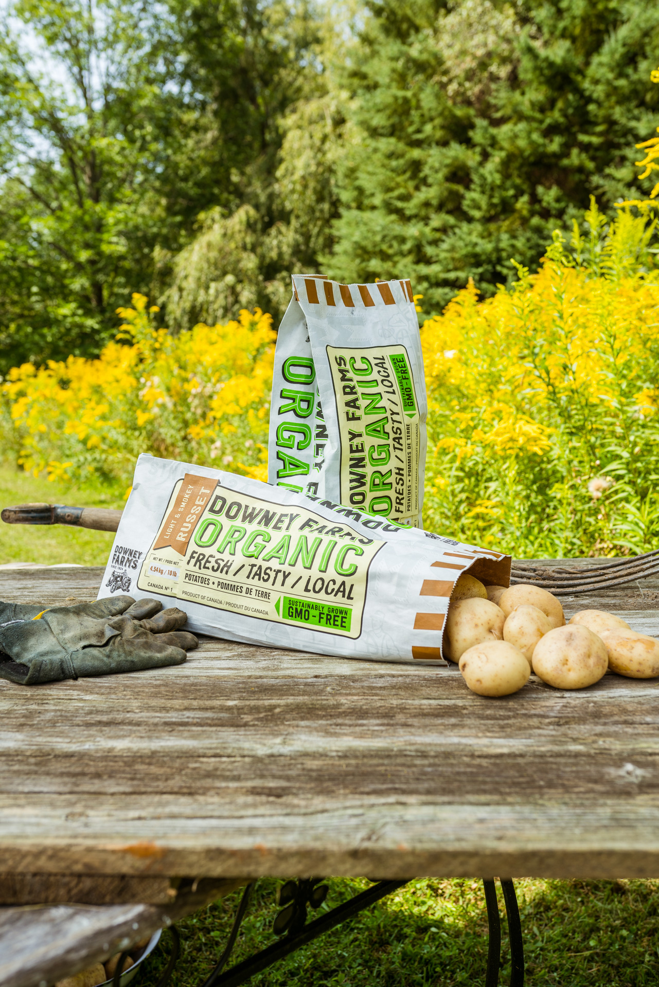
Bold, heritage-inspired typography was used as the main graphic element to stand out on the shelf. We also wanted to communicate that Downey Farms has nothing to hide, so we incorporated transparent areas on the bag to showcase their beautiful organic potatoes.
We are always thinking about the consumer in every design, so we added a colour coded identification system on the back to make it easier for shoppers to pick the right potato for their next meal. Food grade matte inks with a sublet watermark completed the look and gave our bag design a hearty textural feel. This helped to further communicate the notion that these potatoes are organic and fresh from the Downey farm.
The Organic look was such a big hit with the company that they asked us to wrap their fleet of potato trucks in the new design. Now Downey has a recognizable moving billboard to spread to word.
Project Scope:
Name Development
Branding
Identity
Art Direction
Package Design
Copywriting


